Monday, November 7, 2016
Nidhogg 2's incredible art style...
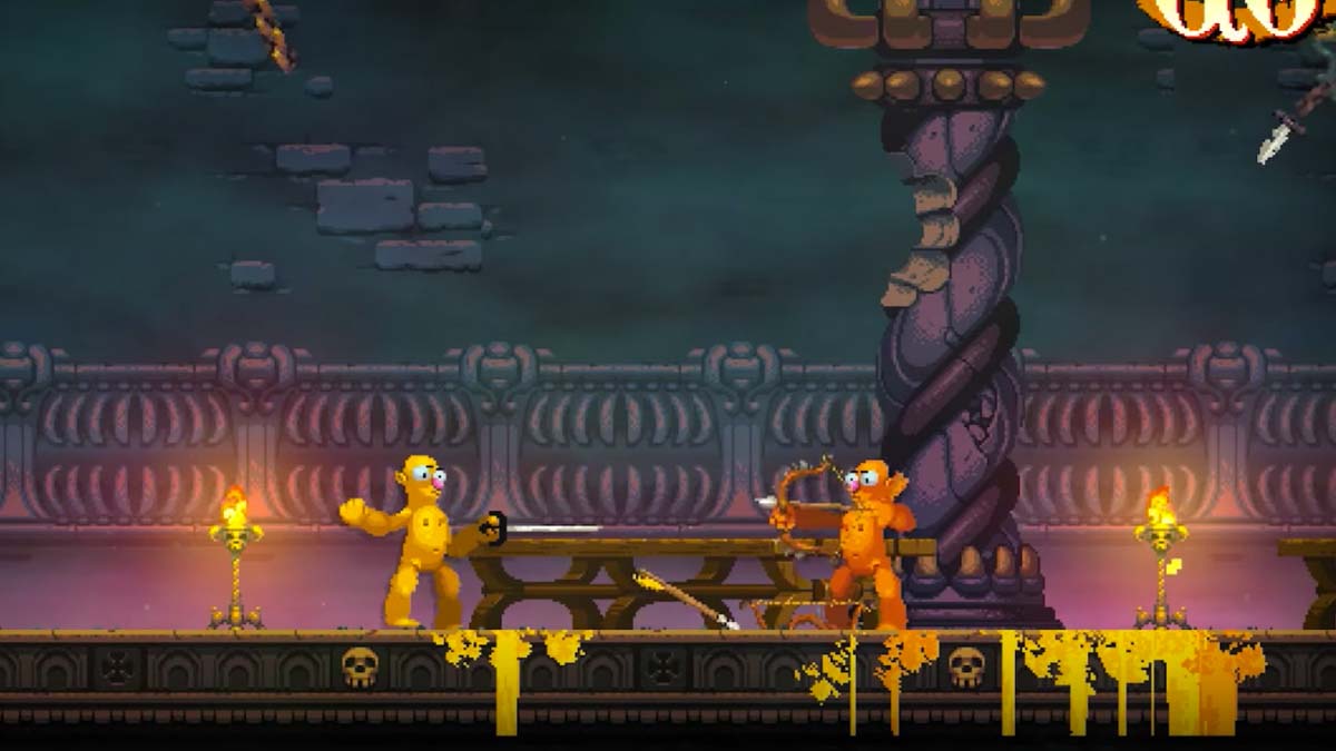
Nidhogg 2 is the sequel to a neat indie title that was all about one-on-one fencing type combat. It was simple, but lovable (according to those who've played it), and was especially good for couch multiplayer. The game seemed to be a great success, and now we're looking at a sequel coming out. Yay! However there's one unmistakable and strange decision that has some people a little concerned... let's see if you can spot the difference:
A little odd, huh? Well it's crazier in-motion. People are really off-put on the new look, and suggest it's like trying to imagine a nude homer rip-off, or the same for two sesame street characters, and then there's a comment even describing this as perhaps a Chinese bootleg copy of the original game. I can't exactly call any of that wrong either, because the trailer took me by surprise and had me thinking "WTF am I looking at!?" all the same. If this was done on april 1st, I think everyone would think it's a prank animation cooked up to look like the a laughable sequel. Meanwhile the original Nidhogg was just simple pixelmen, and it still looks tame and normal enough by now, complete with a slightly strange and neat artsy bleeding effect. However that's also what makes me go against the grain here, and just admire how incredible this all is. Incredible is truly the perfect word too, because it doesn't necessarily mean a compliment, but rather questions the odds. ...but it is also a compliment from me, because I also said that I admire it for doing just that.
I can point to Nidhogg and say "that's a game where pixel people fence each other" and we're done. I can compare it to atari graphics, or tell you it's another retro aesthetic indie game, and you generally know what camp to fall into with a game like this. The most interesting thing is that bleeding color that sort of paints the world. That's it. Now with this upcoming game, my explanation is more like... "bat-shit crazy weird naked cartoon doll things throwing axes at each other and bleeding their own skin color". There's no simple comparison in a world full of pre-defined styles, genres, and games. Sure a lot of it is mixing, but we always find a way to drag comparisons in. No, here, it's just Nidhogg 2 and that's all I can leave with on my mind, unless I try to leap to outside medias like earlier where I mentioned Homer Simpson.... and even that is vague. If you walk up and tell someone you've got nude homer clones beating each other with axes, swords, and bows, while avoiding death by giant worm, you'd be so confused and yet interested in what weird game the indie world has unleashed, or what it has to do with the Nidhogg name if you're somewhat familiar. Perhaps it's technically a failure of marketing when they're no simple pitch, but heck this is a sequel, so I don't think that matters so much. The worst thing to worry about is nagging purists, who would rather have Nidhogg stay as a "timeless" generic retro pixel game #874 on the digital store page. ...or you could be fucking incredible and have people's jaw drop in confusion as they see the game for the first time!
Look, it's weird, and yes it's ugly. I get that. It's absurd, it's silly, it's confusing, and it was revealed with no warning or clue; Yet I kind of admire that, and that's why I'm even here talking about it. I feel like the people disliking it, are the same type that would have fussed about Windwaker, or the ones calling the new Doom out as a generic Halo type game, but both games wound up being amazing and proving the vocal outcry wrong. People don't tend to have a very open mind about these things, and don't pay much attention to the finer details or disciplines. That's part of what always worries me about how vocal and dependent on the internet we are. What if they're really going to cave-in and change everything? I'd like to hope not, or they meet us half-way and find a way to actually implement a toggle graphics function or pixel character skins. Meanwhile though, I personally think this is a great step. They struck a more original style rarely seen, and I appreciate being actually confused and intrigued for once at a game all over again without it interfering with me knowing the mechanics. I can still tell this is a fast-paced one on one combat game like the first, but this time I have nothing to visually compare it to. No "oh it's just cell-shading, or it's retro, or it's going for semi-realism", no it's... it's just fucking Nidhogg 2. That's all it is. That's all it needs to be, and that's awesome. For better or worse, it's also technically incredible, and it has me talking about a game I would have otherwise just dismissed as a sequel to an indie game I might play someday. Well, now it's burned on my mind... so good job guys.
Subscribe to:
Post Comments (Atom)
Too good for fun
Before I even start, I know in some capacity this article is either silly, or ironically getting worked up in semantics as a resp...

-
Before I even start, I know in some capacity this article is either silly, or ironically getting worked up in semantics as a resp...
-
I ended up missing any inspiration during the window of time I had to work on and publish and article around April Fools day or Easter...


No comments:
Post a Comment